What is Data Visualisation & Dashboarding?
With any business large or small we are all bombarded with large amounts of accounting data which can sometimes be hard to read if you aren’t an accountant or are a more visual learner. Using data visualisation & dashboarding software or reporting software that puts reports into a more visual format makes it easier to process the data overload and can help improve the quality of your decision-making within your business.
Data visualisation & dashboarding tools are also useful for accountants to help them see beyond the numbers and help their clients interpret patterns and trends within a business. By using add-on software visual elements such as charts, dashboards, and graphs can be added to reports to create an easier way to understand your business data. Some of these apps also allow you to add in extras like KPI’s etc to give you more useful data.
Benefits of Data Visualisation & Dashboarding Software
There are quite a few benefits of data visualisation:
- Improve workflows, identify trends and speed up spotting errors.
- Automate the generation of reports which will save time
- Make data easier to read
Enhanced Decision Making
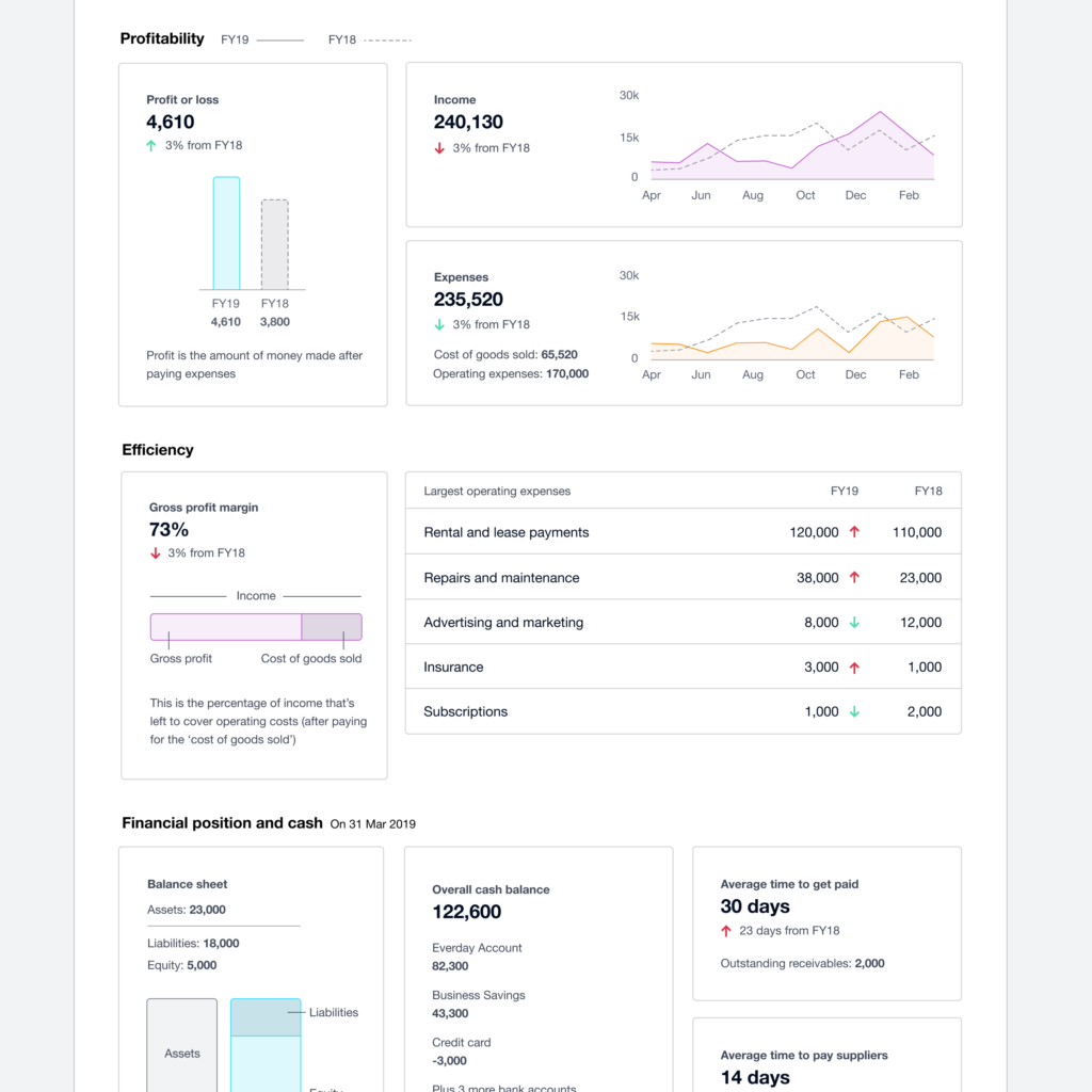
Data visualisation tools can assist business owners and their advisors to make better decisions whether it is in their current business or in a new business purchase as it allows you to easily assess the different options.
For example: If you were trying to decide between two companies which would be the best to invest in. Without extra reporting tools you would need to manually compare a variety of information and calculate multiple ratios which can be time-consuming and possibly full of errors.
Using a Data visualisation tool such as Futurli, Syft or Cashflow Story, you would quickly and easily see which of the two companies would be better to invest in. There is also a very basic dashboard now within Xero that can be found on the Business dropdown.
Greater Clarity and Communication
Data visualisation can make financial information easier to understand when you are talking with your accountant especially if you find they speak mumbo jumbo and don’t make it easy for you to understand what they are talking about. It is also good when speaking with managers or business coaches as these people are not always numbers people.
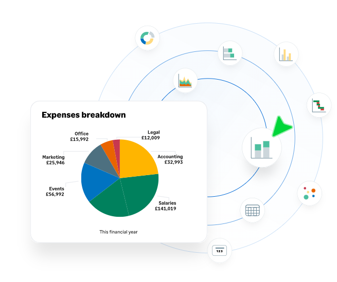
For Example: if you are trying to explain to a manager that their department is over-budget. With a visual, like a pie chart showing the department’s budget and another showing costs, they can more easily see where the money is being spent and identify areas which are causing concern.
Improved Data Analysis
Data visualisation can make the data easier to read and can improve the quality of your data analysis over time as you will be able to spot trends and patterns easier. For example: if you are looking at a table of figures, without using any visualisation tools it would be very hard to spot trends. However, if that data is used to create a line graph you will quickly see any trends and will be able to make better decisions.
Different Types of Data Visuals
Some of the common types of visuals used in accounting reporting include:
- Dashboards
- Bar Charts
- Line Charts
- Pie Charts
- Infographics
- Tables
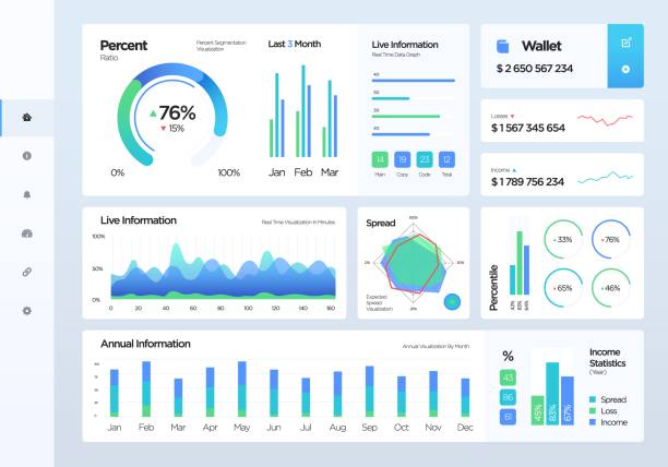
What is a Dashboard? and What Information should be Displayed?
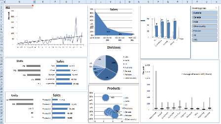
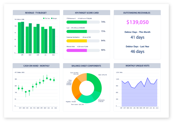
Dashboards are a tool that analyses and displays KPI’s and key data. The dashboard displays easy to read information that is important to your business. Most dashboarding software is quite customisable so you can set it up to show the most important data for your business. The Xero example that you saw earlier in this article is quite a basic dashboard and isn’t customisable it will show the same graphs & visuals for any company that you view whereas a Spotlight or Futrli dashboard (examples above) are all customisable and each companies dashboard will be very different.
There are many benefits to using a dashboarding software:
- Makes data easier to understand
- Can Visualise multiple KPI’s at once
- Create reports quickly
- Increases accessibility and collaboration
Before creating a dashboard you will need to determine the purpose and what information you need to view. Dashboards can be effective with a single graph or visual however you need to ensure that you don’t overload your dashboard and overwhelm yourself with all the information that is being displayed.
There are many data visualisation & dashboarding apps available so you need to decide what you need to see in your reports or on your dashboard to ensure you use the right one. We will look at a few options in next week’s article. Excel can be used as well, if you know how to use it to create graphs it is a cheap solution as most computers have it otherwise google sheets can be used. Just remember that the data isn’t automatically flowing into it so the data can become outdated quickly. Using an add-on to Xero or MYOB with live data flowing all the time will ensure that your dashboards and visuals are always up to date and you have the latest data to use to make decisions from.